Formatting for the Six-Second Scan
Before anyone reads a word, they see a shape. A calm, scannable layout buys you the second look — a cramped one loses it instantly.
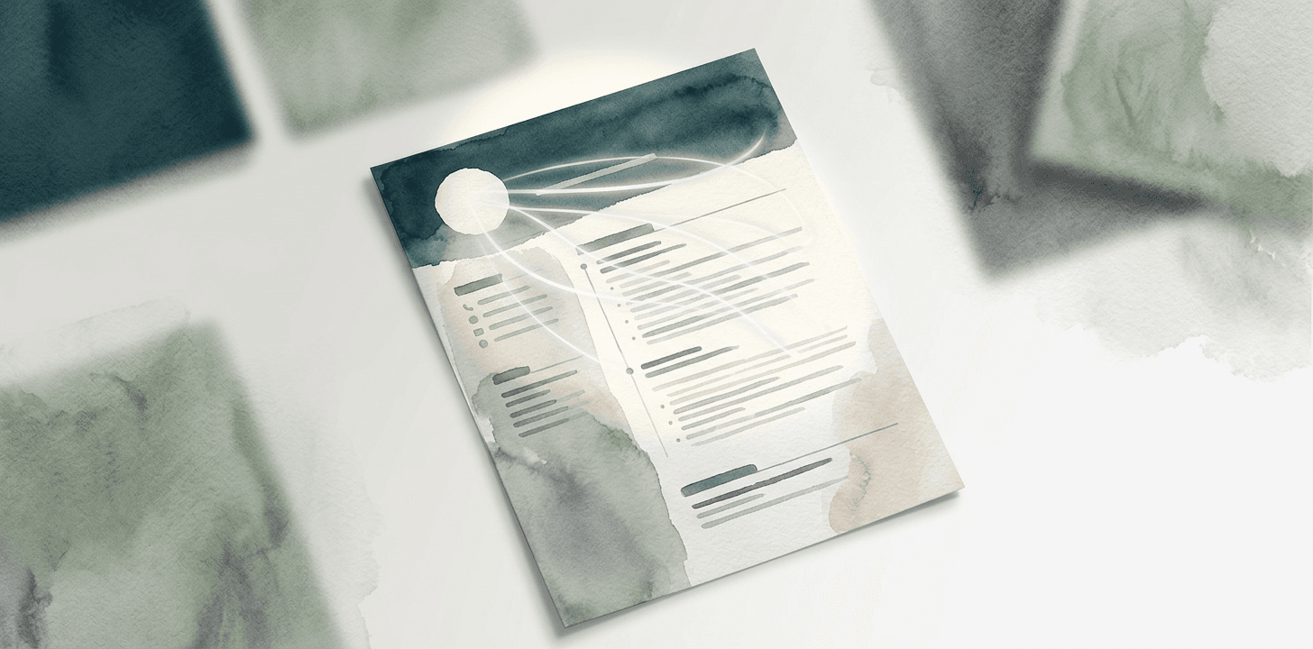
I spent eight years screening resumes, and I can tell you what the first pass actually is: not reading. Scanning. In those first seconds the brain registers the shape of the page long before it parses any sentence.
White space is a feature, not waste
A dense, wall-to-wall page signals "this will be work to read," and a tired recruiter looks for any excuse to move on. Generous margins and spacing between sections signal the opposite: this person is organized, and reading them will be easy.
Make the hierarchy obvious
The eye should fall, in order, on your name, your most recent title, and the company. If everything is the same size and weight, nothing leads — and the reader has to do the work you should have done for them.
- One clear typeface, two at most.
- Consistent dates, right-aligned, easy to track down the page.
- Section headers that are unmistakably headers.
Clever layouts impress designers and confuse parsers. The resume that gets read is the one that's boring to look at and effortless to scan.
Single column, every time
Multi-column layouts break applicant tracking systems and scatter the reader's eye. A single column reads top-to-bottom the way both humans and parsers expect. Save the visual flair for your portfolio site.
Every Resumez template is single-column and ATS-tested by default, so the shape is already working for you before you write a line.
You don't get six seconds to make your case. You get six seconds to earn the next sixty. Spend them on a page that looks calm, confident, and easy.